In 2025, mobile shopping isn’t the future—it’s the present. More than 70% of online purchases now happen on smartphones, which means your ecommerce store must deliver a fast, seamless, and mobile-optimized experience. That’s where mobile‑first ecommerce website design trends come in.
Brands that focus on mobile-first design aren’t just improving looks—they’re increasing speed, engagement, and conversion.
🚀 What Is Mobile‑First Design?
Mobile-first design means building your ecommerce website for smartphones and small screens first, then expanding the design for tablets and desktops. This approach ensures your most valuable customers—mobile users—get the best experience from the start.
🔥 Top Mobile‑First Ecommerce Website Design Trends in 2025
1. Thumb-Friendly Navigation
Menus, buttons, and product filters are placed where your thumb naturally lands. Easy access = better UX.
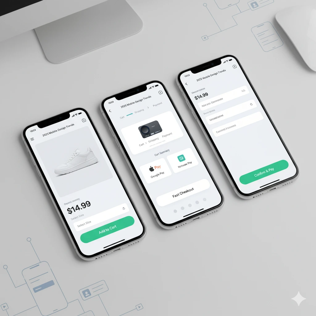
2. Minimalist Layouts with Bold CTAs
Clean, focused pages with large images and clear calls-to-action are key. Shoppers don’t want clutter—they want speed.
3. Mobile Checkout Optimization
No one wants to pinch and zoom to fill out forms. One-click checkout, auto-filled fields, and wallet integrations (Apple Pay, Google Pay) are part of modern mobile‑first ecommerce website design trends.
4. Progressive Web Apps (PWAs)
PWAs offer app-like experiences without the download. They load faster, work offline, and boost engagement—perfect for mobile-first design.
5. Voice Search and Smart Filters
As voice assistants grow, expect more users to search with voice. Mobile-first design now includes speech-friendly interfaces and simplified navigation.
📈 Why These Trends Matter
With mobile devices driving the majority of online traffic, following mobile‑first ecommerce website design trends means:
- Higher conversion rates
- Faster page loading
- Lower bounce rates
- Improved SEO (Google prioritizes mobile-optimized pages)
- Better customer satisfaction
Simply put, your mobile design is now your main storefront.
Final Thoughts
If you’re still designing your ecommerce site with desktop first, it’s time to rethink. In 2025, mobile‑first ecommerce website design trends are not optional—they’re essential to staying relevant and competitive in a mobile-driven market.
❓Frequently Asked Questions
1. Is mobile-first design only for big brands?
Answer:
No. Whether you’re a small startup or an enterprise, mobile-first design benefits everyone. It improves user experience, boosts sales, and helps your brand grow—especially among younger, mobile-native audiences.
2. What’s the difference between responsive and mobile-first design?
Answer:
Responsive design adapts to different screens, starting with desktop. Mobile-first design starts with mobile, ensuring the mobile version is prioritized and fully optimized from the beginning.
3. How can I check if my ecommerce site is mobile-optimized?
Answer:
Use tools like Google’s Mobile-Friendly Test or Lighthouse audit. Or, test your site manually on multiple phones to see how fast it loads, how easy it is to navigate, and if checkout is smooth.
Leave a Reply